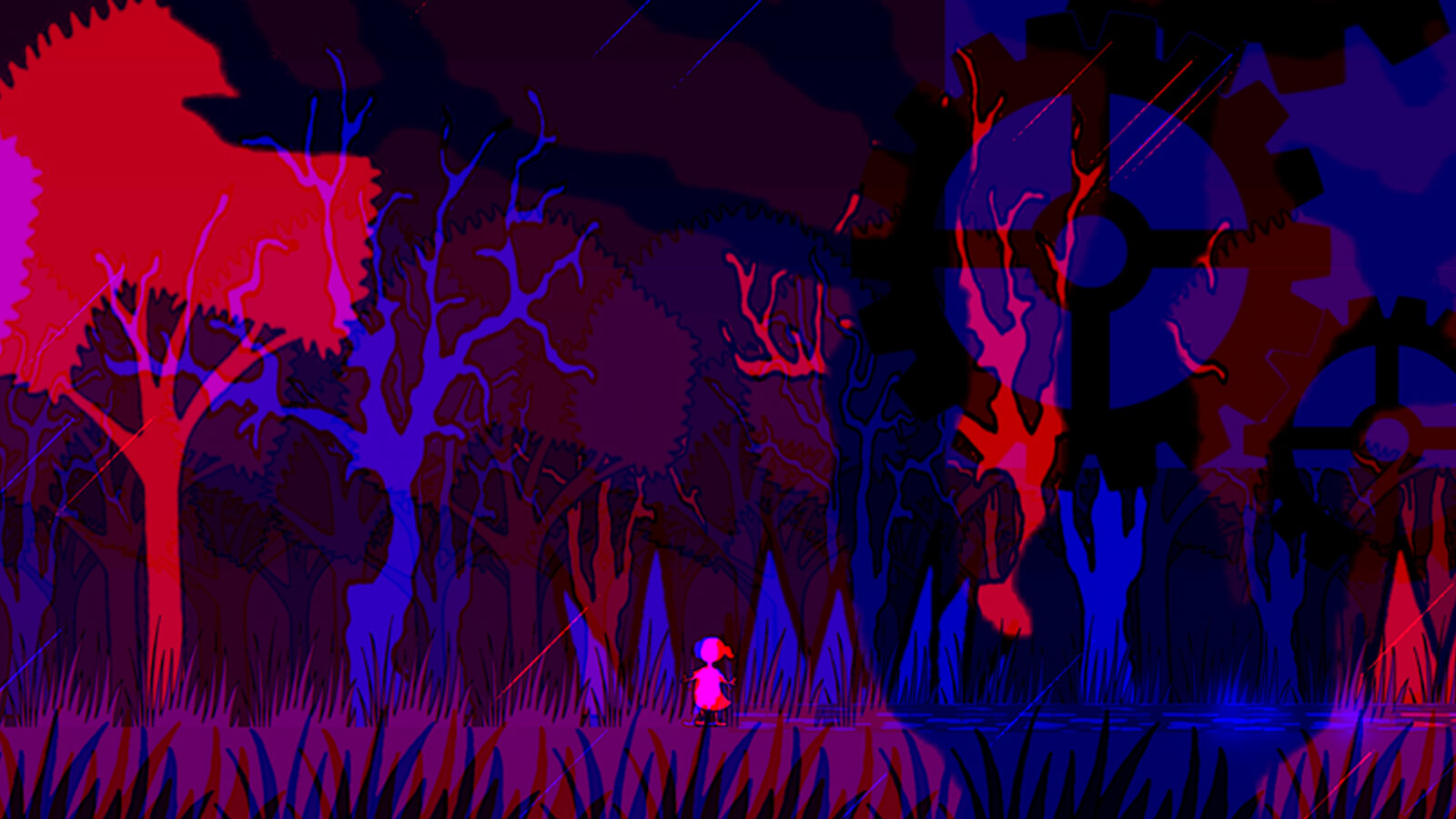
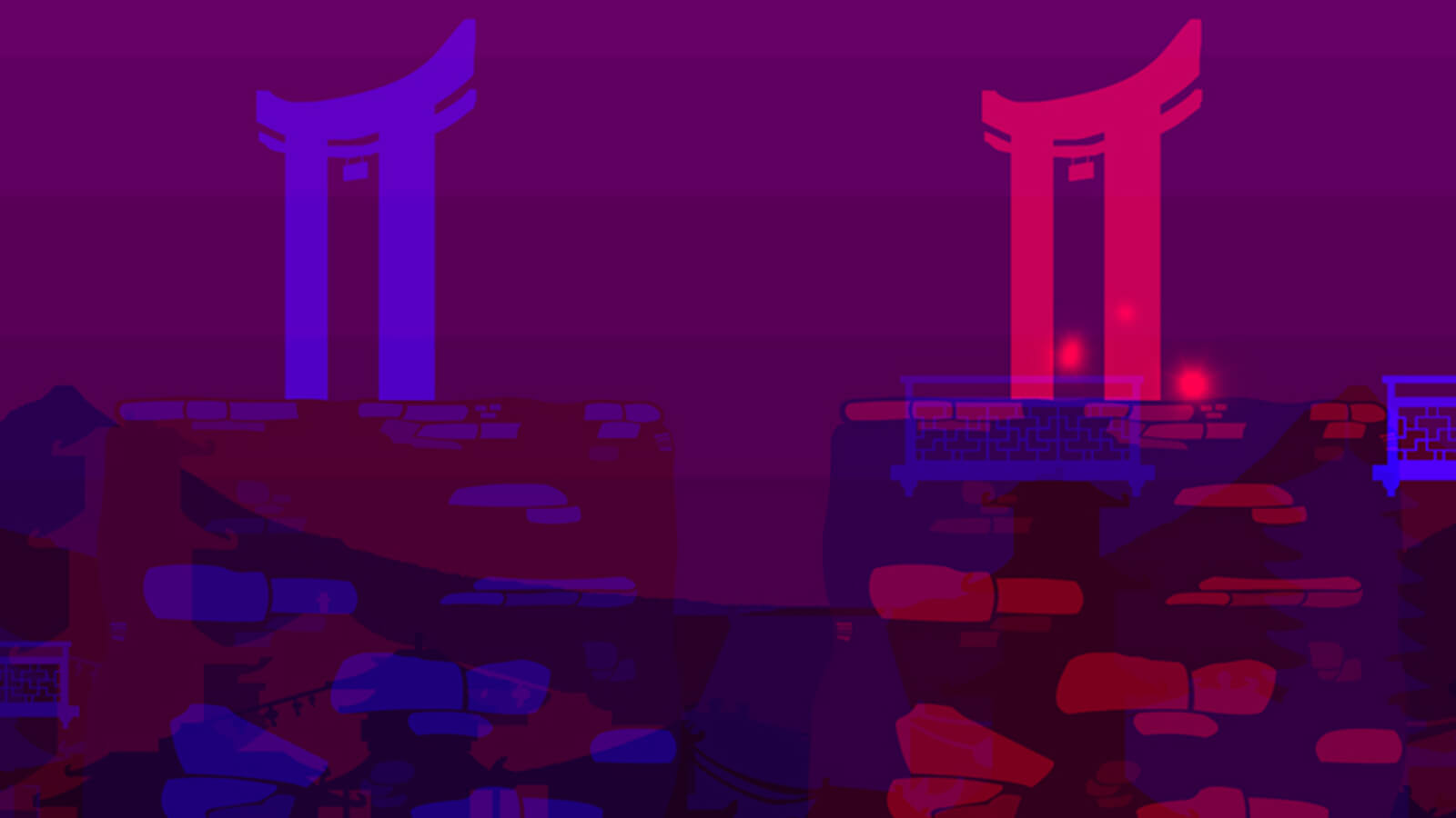
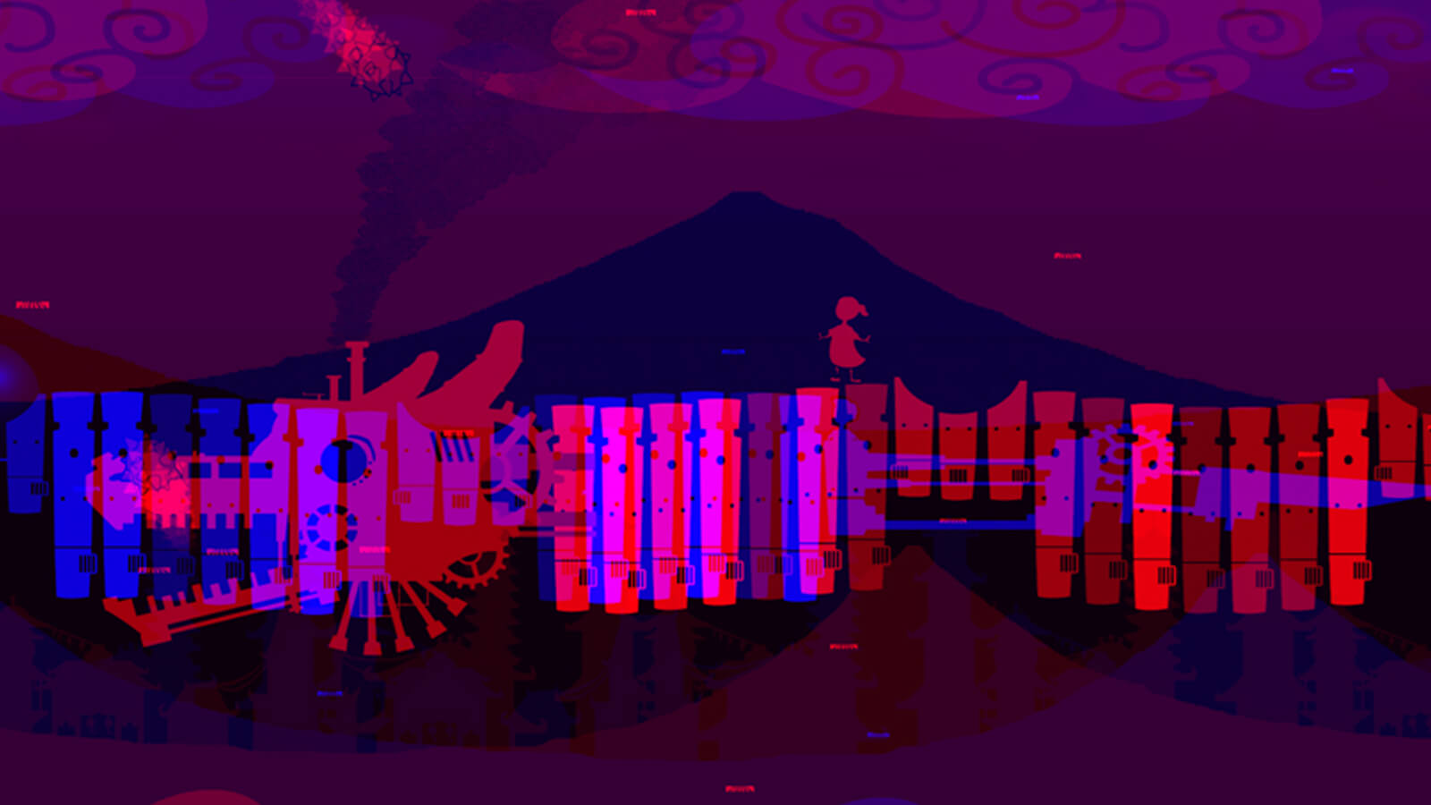
A brother and sister must navigate their way through the dangerous world of their imagination. Although both players in this 2D co-op puzzle platformer look at the same screen to play it, they won’t see the same things. In Sunder, each player will need to put on either a pair of red or blue decoder glasses, filtering how their similar, but slightly different environments appear. Those slight differences are key, as players will need to verbally communicate what they’re seeing in order to beat enemies and complete puzzles.
Sunder’s visual style grew from its unique, color-coded red and blue design. Knowing they didn’t want to confuse players, and given the limited two-color palette, the developers decided they would need to use heavy contour lines, distinct silhouettes and easily recognizable shapes. After some thinking, the developers realized those qualities also described the aesthetic of children’s books, an aesthetic they committed to both in their environmental design, as well as in their characters, which they made children as well.


