DigiPen’s BA in Game Design program is built around six specialty tracks – level design, narrative design, systems design, technical design, user experience design, and user research. Students spend their first two years learning about each design discipline, then choose two disciplines they would like to specialize in at the end of their sophomore year. While all six disciplines overlap and interact with one another, this series takes a closer look at each individual specialty track.
When making a game, it’s important to consider how you want the player to feel. DigiPen design students quickly learn how to use every sensory channel at their disposal to create those feelings through the power of user experience design. “User experience (UX) is every aspect of how you interact with something,” says DigiPen senior lecturer Rich Rowan.
Despite its expansive scope, many people simply associate UX with user interface (UI) design — a subset of UX concerned with designing menus, heads-up displays (HUDs), and information layout for ease of use. “You even hear people call it UX/UI design a lot,” Rowan says. “But UI is just the visual tip of the iceberg of user experience. In games, user experience is everything from someone’s first time hearing about the product, to the interface, the sounds, how your character moves, how the game feels to play, feedback, how you interact with the controller or hardware, and more. In essence, UX is about trying to solve the design problem of getting a user to experience something.”
To do that, UX designers typically start projects by asking one vital question: Who are the users? “Oftentimes if you ask someone who they’re developing a game for, they’ll say, ‘Everyone,’ which is effectively the same as saying, ‘No one,’” Rowan explains. UX designers help steer the shape of a project from the beginning by creating customer personas — well-crafted and researched profiles of who the most typical users might be.
At DigiPen, game design students pair up in teams of three to create customer personas in their first-level UX course. “Say we’re designing a massively multiplayer online game. Often, you’ll attach a name to the personas, like Rachel the Raider,” Rowan says. “She’s a person who likes playing big team-based raids. Then there’s Social Sarah, who is less competitive, but very interested in the game’s social element. Then maybe there’s Edgar the Experience Hound, who is completely focused on grinding for XP and leveling up. Before you start designing an experience, it’s crucial to think through what drives the people experiencing it.” A UX designer’s job is to ensure that every aspect of the game’s development prioritizes and connects back to those people.
Beyond its sociological element, UX design also blends art and psychology in unique ways — whether that’s through creating smart UI elements, inventive control schemes, or clever sensory feedback. Although UX designers don’t have to be artists, per se, they do use art and graphic design terms quite often — but only inasmuch as they have the ability to change people’s experiences. In one lab exercise assigned in DigiPen’s first-level UX course, students must arrange and combine a number of graphic elements to try and create the best visual game composition. “We teach you what alignment does mentally and perceptually, and then we critique the layout you’ve designed based on that,” Rowan says. “For instance, if you’ve got a visual of a person, you want them to be looking toward the mid-line of the screen, because people are genetically trained to follow people’s eyes and line of sight. We talk about line of action, an art term, but also the psychology of how people process information.”
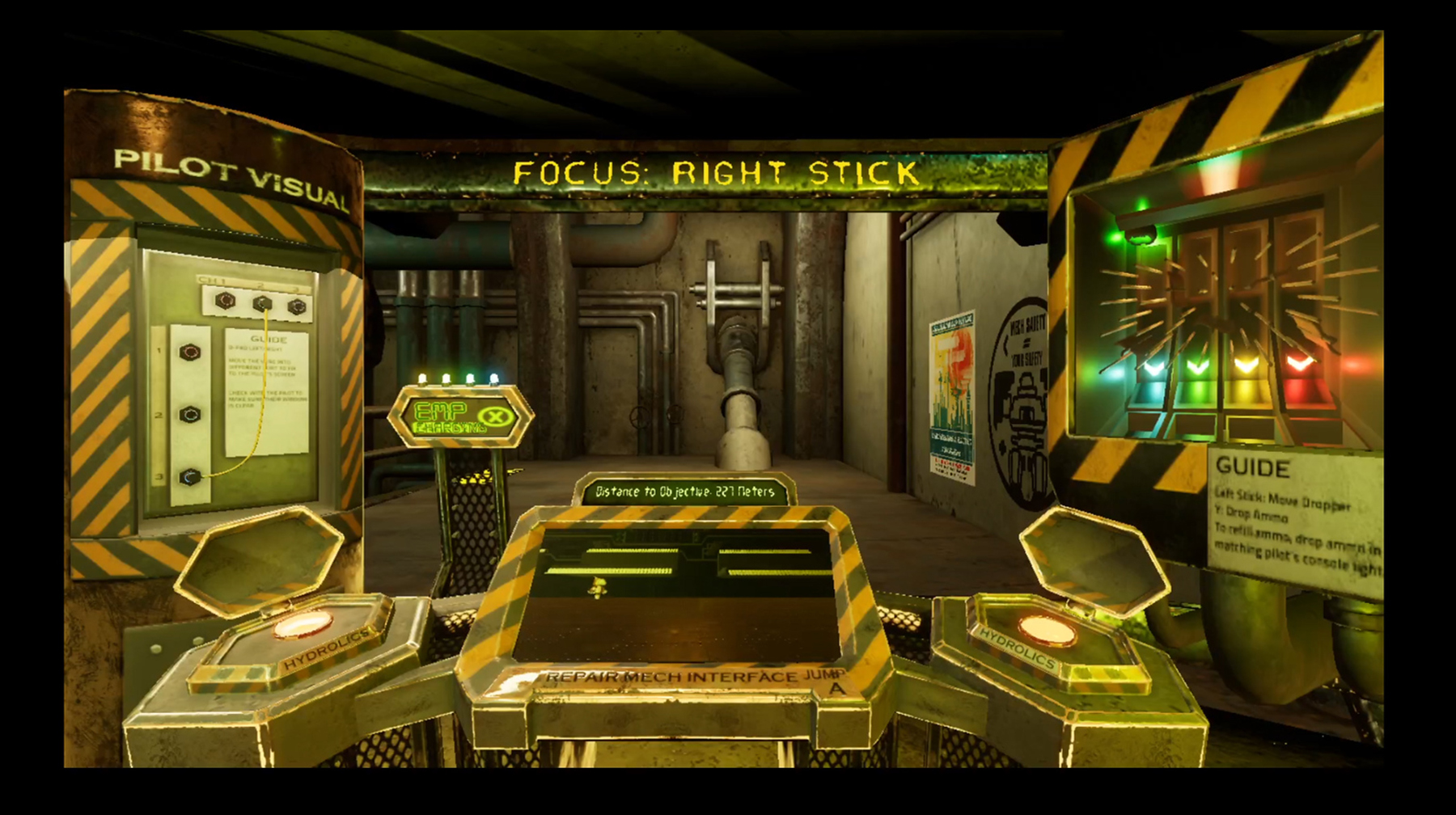
DigiPen students learn about the power in combining art and psychology through UX with lots of real-world examples as well. “When we talk about creating conceptual models around controller layouts, I often bring up the original Assassin’s Creed,” Rowan says. “In that game, the movement actions are related to the A button, the bottom button, the feet button. The mental actions are related to the Y button, the top button, the head button. Attacks and blocks are related to the B and X buttons, the left and right buttons, the arm buttons.” By using a body-inspired conceptual model, first-time users are able to quickly pick up and remember the game’s controls. “Getting people to learn and remember things about your game, reinforce them, and build on that mastery as they continue playing — that’s all a huge part of UX,” Rowan says.
UX can also solve simple, but vital issues like ensuring important information is visible on screen. “An example I give students is Destiny,” Rowan says. “RGB channels go up to 255, so the UX designers at Bungie compressed the colors of the game itself to 225 and under. They reserved the 225-255 color range for the HUD, so none of the interface gets lost in the background. It doesn’t matter where in the game you are, the HUD will always pop off the screen, even if it’s the same color.”
Later on in their studies, DigiPen game design students interested in UX dive deeper into more complex topics like game feel. “There are certain mechanics that make something a stealth game by definition, but UX is what makes it feel like a stealth game,” Rowan says. “When I was working on a flying game, I actually went to a flight museum and talked to pilots about what it feels like to fly.” UX designers utilize every sensory channel available to them to communicate their targeted experience, something Rowan has students explore in one advanced UX project.
“They have to build a character and a camera that makes you really feel like something in particular. If it’s a big mech, that could be communicated by feedback from the camera shaking with each step, and the heavy, clonking feel of the controls. If it’s a fast car for a racing game, that could be widening the camera’s field of view as you speed up so the world stretches out around you.” That kind of visual and auditory feedback isn’t just crucial in conveying an experience. It can also direct a user’s attention and subtly communicate important information, like the ability to interact with an item or character, impending danger, or status changes.
“UX design goes beyond video games too,” Rowan says. “Physical games have UX. Websites have UX. Furniture has UX. Even museum exhibits often utilize UX designers! If you’ve ever looked at a clunky vending machine and said, ‘Why was this designed this way?’ you might be a UX designer.”
DigiPen BA in Game Design student Jozie Brajkovich on diving into UX design.
“What really drew me to UX design was how close it is to the user. I was drawn to game design initially because I really love making things for people. Once I learned about UX, I realized I loved the user focus of it. Learning who it is you’re creating for, designing for them every step of the way, leaning into the particular engagement for that kind of player, and shaping the game into something that’s accessible and enjoyable.
“I have been the UX designer for most of my game team projects so far. I’m most proud of a lot of the little things. Creating a main menu that teaches the gameplay. Having units sleeping until you mouse over them to show you can interact with them. Creating color highlights combined with simple animations for signifiers and feedback. Making a mouse trail to draw attention to its functionality. Layering feedback for changing game state. It’s all simple things the player probably won’t notice consciously, but they make a huge difference in the player’s understanding of the game.”
Related Articles in this Series

